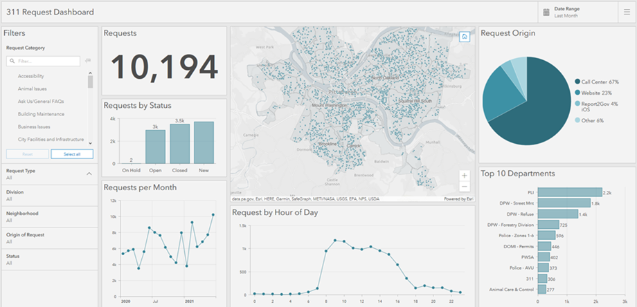
A dashboard is a view of geographic information and data that allows you to monitor events, make decisions, inform others, and see trends. Dashboards are designed to display multiple visualizations that work together on a single screen. They offer a comprehensive view of your data and provide key insights for at-a-glance decision-making. Similar to web maps and web layers, dashboards are part of the ArcGIS geoinformation model. They are items within your organization that can be identified by their icon  when browsing and searching for content.
There are many reasons to create a dashboard, and many types of dashboards you can create. Dashboards allow you to do the following:
- See—in one view—all the data you need to be informed or make decisions.
- Monitor the most important information about your day-to-day operations.
- Ensure all your colleagues are focused on the same goal through viewing and using the same information.
- Monitor in real time the health of a business, product, organizational team, or campaign.
- Inform communities about ongoing events, emergencies, and initiatives.
- Create a personalized view of a larger set of data to show all the metrics that matter to you.
The type of dashboard you create is based on who you're sharing it with and the information you want to convey. Some dashboards are operational in nature and are designed to tell you what is happening now while matching the quickly changing nature of incidents, events, and other activities. Some are more strategic and are ideal for executives and other senior managers interested in monitoring their organization's key performance indicators (KPIs) and metrics. Some dashboards are more analytical and are used to identify data trends or other interesting data characteristics. Last, some are simply informative and are used to tell a story with the data.
Dashboards are created to be intuitive and easy to understand by different teams and people within and outside of an organization. Example users include command chiefs, operations managers, senior executives, GIS managers, GIS analysts, and community members.
Dashboards are composed of configurable elements, such as maps, lists, charts, gauges, and indicators, and occupy 100 percent of the application browser window. Elements can be stacked or grouped together in various ways.
The following are characteristics of an effective dashboard:
- Draws your attention to where it's needed
- Shows what's most important on a screen full of data
- Provides its audience the ability to understand what's happening and respond quickly
- Expresses performance measures clearly, accurately, directly, and without distraction
Most elements are data driven—they represent the information you want to present to the intended audience. As such, dashboards offer filtering capabilities, which enable a refined set of data to be presented to the intended audience. These filters can be applied at design time by the dashboard author or at run time by users viewing the dashboard.
Dashboards can be designed for use in both unattended and attended scenarios. Unattended dashboards are often displayed on a large screen in environments such as operations centers, and provide a more passive user experience. In contrast, attended dashboards are generally viewed on desktop monitors or tablet devices and tend to offer a more interactive user experience.
Once the dashboard is assembled, you can share it with its intended audience. You can share dashboards publicly with everyone or only with people in your organization. You can promote your dashboard by providing a link to it or embedding it in another website or app.
To get started making your own dashboard, see Create a dashboard.